


 Shop floor execution
 Maintenance
 Production
 Skills
.svg) Execution AI
Execution AI
 Quality
 Training & Skills
 Building materials
 Packaging
 CMMS/EAM
 MES
MES
 Connected Worker
 Manufacturing Intelligence
 Case studies
 Blog
Blog
 Ebooks & Guides
 Webinars
 Events
 Downtime Cost Calculator
 Digital Maturity Assessment
 About Us
 Partners
 Newsroom
 Support
 Careers
 Trust center


What is a Pareto chart, and why should you care?
Americans are pretty much born knowing the line, “All men are created equal.” But people aren’t the same as problems — especially in manufacturing. If you treat every problem the exact same way, you’re going to create — well — more problems.
What you need is a clean, user-friendly chart to help you keep track of issues, their frequency, and their relative importance. Luckily, with the right data, you can have just that.
Here’s everything you need to know about the Pareto chart: what it is, why it matters, and how to make one.
What is a Pareto chart, anyway?
You’ve probably never seen much need to celebrate “thank an Italian engineer and economist from the 1800s” day. Of course, you might change your mind once you see a Pareto chart created with just a few clicks.
Named after its inventor, Vilfredo Pareto, the Pareto chart makes use of a concept you may have learned in economics class. The 80/20 rule, also known as the Pareto principle, asserts that 80% of problems come from 20% of causes. Simply put, most of the trouble in your manufacturing plant can be traced to a small handful of issues — and Pareto charts help you identify those issues by identifying the ones with the highest frequency and comparing them against a cumulative percentage line.
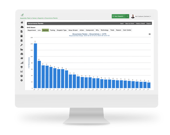
Picture your average bar chart. The X-axis represents the types of problems that are occurring, such as differing types of Quality defects, on the plant floor. The Y-axis represents the number of times each of these different events occurs.
What turns this bar graph into a Pareto chart template is a line drawn opposite of the X-axis, sometimes called the "right vertical axis." This is where you keep track of the cumulative percentage to see which issues end up in the 20% identified by the Pareto principle. By calculating the cumulative percentage and plotting points for each individual problem, you essentially turn your bar chart into a line graph, and violà — you can perform Pareto analysis.
Why manufacturers love the Pareto chart
This probably isn’t the first time you’ve seen Pareto charts, even if you’ve never used them or known exactly what they were for. But why are they such a big deal in manufacturing, and how do they help with everything from quality control and improvement efforts to budget improvements and supply chain management?
Essentially, Pareto charts can be tremendously helpful in identifying, prioritizing, and solving the most pressing problems in your plant. They require high-quality raw data to be accurate, as well as a team committed to continuous improvement.
Even where a plant culture isn't accustomed to shared data like this, we've found that introducing this chart type to group meetings can quickly change hearts and minds. People get excited about being on the same page and seeing real improvements in day-to-day operations.
Here are a few more things that make Pareto charts a big hit among manufacturers:
They provide at-a-glance information
There’s a reason the good old bar chart and line graph are so popular on their own: They give you the whole story in just seconds. When you put them together and add the Pareto principle as a cherry on top, you get even more valuable information about your processes, assets, quality management, and more.
Keep in mind that this is only possible if you translate raw data into one shared “language.” While different parts of your plant may prioritize different parts of the same story, it all needs to come together to be organized by type, frequency, and cumulative percentage.
They keep you flexible
If the past few years have taught us anything, it’s that manufacturing systems need flexibility. Pareto chart analysis may only be a small part of that, but it’s a significant one. The idea is to always know where your focus belongs, even if that means changing direction when a new problem appears on the horizon and starts climbing that X-axis.
They streamline decision-making and problem-solving
Imagine you’d never read this helpful blog post and had no idea how to use Pareto charts. You might make your maintenance decisions based on flawed approaches. Instead of immediately identifying the top 20% of problems causing 80% of your strife and addressing them appropriately, you’d be left with less reliable data and a whole lot of guesswork.
They help lean manufacturing keep its promises
Are you one of many manufacturers who’s been personally disappointed by lean manufacturing? The good news is that a Pareto diagram might just save the day. In many ways, it bridges the gap between smart manufacturing systems and lean manufacturing approaches, helping keep promises made by the latter approach. Think about it like this: Smart manufacturing handles the data capture and chart creation processes, while lean manufacturing is responsible for guiding your approach to that information.
Where does Pareto chart data come from?
We’ve talked a lot about data, but we haven’t addressed the elephant in the room: Where does all this data come from?
The problem with Pareto charts is that, without the right system for data capture and management, you won’t be able to fill in the necessary information. For example, you might know what your problems are, but you won’t be sure how often they occur — which means you won’t be able to calculate the cumulative percentage or use the Pareto principle.
In other cases, you might have a system in place, but it isn’t up to the task. Technically speaking, manual data capture is a system — but by the time you run all the numbers and manually enter them into spreadsheets, your Pareto charts are outdated. You’ll end up making decisions that hurt more than they help. In this way, bad information is just as troublesome as no information at all.
The key is to choose a smart manufacturing system that prioritizes four things:
-
Depth: You need all the data from every source if you want to create an effective Pareto chart. That means your system has to capture information from machines, sensors, workers, and more.
-
Visibility: If you’re going to collect and manage all this data, it’s vital that you do so in an accessible, user-friendly platform. That way, everyone has full visibility and can contribute to a more complete view of your plant.
-
Accuracy: Manual or outdated processes can lead to outdated, inaccurate, and incomplete data. A smart manufacturing system needs to ensure accuracy through speed — for example, wearable devices enabling real-time data collection.
-
Connectivity: When your plant is connected, people and machines communicate more easily. That means better (and more) data — which, in turn, means a more accurate Pareto chart.
So, what’s the key takeaway here? Simple: You can’t rely on spreadsheets and other outdated approaches to inform your Pareto analysis. You need data capture that keeps up with data creation, and for that, you need a smart system like L2L.
Remember when we said you could create a Pareto chart in just a few clicks? That’s possible because the L2L platform helps you track data across the plant floor. It’s smart enough to do the hard work for you — measuring different issues, comparing their frequency and giving you constant insight into the cumulative impact of every problem. It also has a built-in Pareto chart maker to boot.
If you want to make better decisions, start with better data.
Start building a Pareto chart with better data
A lot goes into creating the perfect Pareto chart. To leverage these bar graph/line chart hybrids, you’ll need a system that’s up to the task — and L2L has your back.
The L2L Connected Workforce Platform gives you everything you need to connect your workers, monitor your machines, and get better data from your plant. It also has built-in features to automatically build and fill Pareto charts, so you’ll never be anchored by spreadsheets again.
Today’s the day. Book a demo to see how L2L can put Pareto charts (and other smart manufacturing tools and solutions!) in the palm of your hand.
.svg)
